You can find part one of this series here.
It wasn't until I had a finished CD in my hand that the idea for Open G Records came. It came from my engineer, Adam Abeshouse. We had just finished listening to the master, and Adam was burning the master CD. I said, "so what now? Who should I give this to?". Adam said, "honestly, Chris, in 2012 (which it was) I don't know why you need to give it to anybody." By the time I had arrived back in the city, perhaps a half hour on the Metro North from Pelham, I had basically decided on the idea that would become Open G Records. You can read more about that process in one of my very first blogs right here.
I decided to call the CD "A Function of Memory" (I actually much prefer to call them "albums" or "records" - I'm attracted to albums that hold up as a long single idea, rather than a collection of songs). I like the vagueness of the meaning of the words "A Function of Memory", and it's the title of one of the pieces on the record by my friend Ed Jacobs. The title is also reflective of what was happening in my life - my mother had died quickly and horribly of brain cancer just six months or so prior to my first recording session for the project. Her death and its aftermath and grief permeated my thoughts during that entire period of my life, and it was impossible for me to separate the process of making the recording with the experience of going through a period of profound grief and sadness. So I decided not to. A Function of Memory would, in its full realization, overtly be about my mom and my relationship with her.
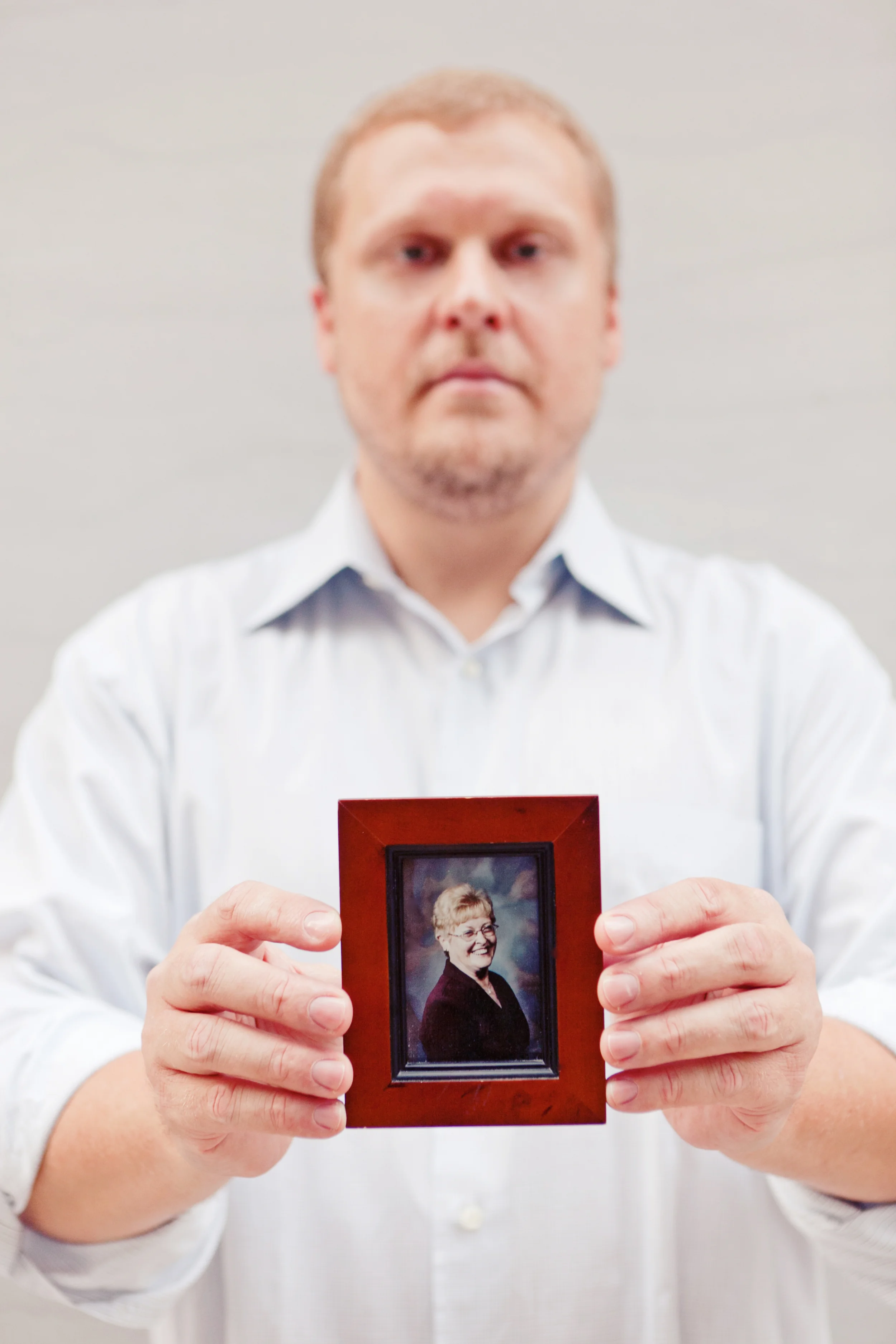
So, Chris Glass and I started with three things: a completed record, the title, and this photograph:
Photo credit: Heather Waraksa
That's my favorite picture of my mom. It captures her genuine and gentle soul in that smile. I keep it on my desk and she watches me practice. In the end, as you will see, Chris used the colors in that photo to inform the look of the whole package in a subtle, brilliant, and beautiful way.
First Chris sent me several different looks:
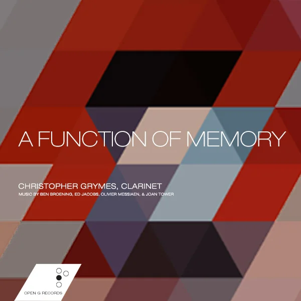
Geometric color blocks. This is actually a very largely "pixelated" version of the photo above. These colors would inform the whole project
I liked this a bit - it has some movement and an idea of electric excitement, which is how I feel about my playing
I didn't like this one as much. It seems a little obvious, and it made me think of Jon Krakauer's book, "Under The Banner of Heaven"
Plus, I'm really more of an indoors kind of guy
I actually loved this one. It's suitably obtuse. I love the colors. This one speaks to me, and has a companion photo:
Again, I love this. It just resonates with me in a really undefinable way. It seemed to fit the idea of A Function of Memory.
So, I felt like we were close. Turns out the final design looks nothing like any of those. Chris works at a shop called Wire & Twine (that's our fine Mr. Glass on the right, there) and while listening to the record and talking about it with his partner, they put together this look we call "icons".
This one originally introduced the idea of using icons for the different pieces on the record. This one I think we called "circuit". At least I did.
When Chris sent this to me, it was with some sort of caveat, something like, "I don't know if you'll like this, it's a little out of left field, but we kind of love it and we don't know why". I had the exact same reaction. Here's why: the record has six pieces on it. The first and last pieces are direct reflections of each other - in fact, my part is exactly the same in both, though the first is for clarinet and piano and the last is for clarinet and computer (Ben Broening's Arioso and Arioso/Doubles, respectively). The second piece on the record is the only one with multiple movements: three. I loved how elegantly this idea showed the actual structure of the record, but was also, again, suitably obtuse for my sensibility. We decided we were onto an idea. Chris played with it a bit:
And then Chris sent me this:
He'd changed the icons to squares (subtle, but noticeable - lots of logos and such were moving to a square design: it felt fresher to me), added color to the icons, separated the last two icons in the second "piece" to reflect how the movements worked in the music (the second and third movements are played without a break - again, pretty subtle). Most importantly, Chris had spread the icons out and added those scribbles. I love love loved it. Still do. It reflects how the different pieces are occasionally loosely connected, but ultimately bound together. We went after this idea hard. We changed the icons slightly, went with a deep red instead of the white background, and after some slight wiggling came upon our final design:
I really love this (one would hope, right?) One of the cool things about the final design is that the "squiggles" continue on to the back cover, a design element that Chris has carried over into the other releases, as we'll get to.
So that's how we collaborated to make the art for "A Function of Memory". I'm proud of how beautiful, thoughtful, and meaningful everything is. And, to get back to point I made earlier: look at the colors and then scroll back up to see the original picture of my hands holding my mom's photograph. All of the colors Chris used came from the photo of my mom, including the frame. It's so subtle and remarkable. I still just stare at it occasionally. Below I'm going to present the entirety of the package, which is an eight-fold booklet.
Look for parts three and four of this series of blogs, coming soon!
Front cover
Back cover
Interior art/introduction
My notes, page 1 (these only take up two pages in the actual CD package)
Notes, page 2
Notes page 3
Notes, page 4
Credits
Mom


